Is the market overvalued?
Is the market overvalued?
8 Mar 2021
You don't have to search far and wide to find articles about the imminent stock market crash. Seeing how quickly the markets rebounded after COVID-19 has left many investors bewildered and sceptical over the market recovery's legitimacy, with many crying that the markets are overvalued or in a bubble.
There are clear arguments on both sides: maybe markets are overvalued, perhaps they are not. Here we present both sides of the argument with a specific focus on the S&P 500. We'll take a look at some of the data on both sides of the camp to provide a balanced discussion on whether the markets are overvalued.
When reviewing the research, there are two distinct thoughts. Any ratios that focus on absolute values (Price / Earnings and Market Value / GDP) show the markets being at very high valuations, at levels last seen during the dot com bubble. However, when we look deeper and put these metrics in the context of the current interest rate environment, the high level of profitability of the current companies in the S&P 500, and the significant forecasted growth rate, markets don't look so expensive. As Warren Buffet has said for the past three years, "if low-interest rates are here to stay, equity markets are looking extremely cheap". The problem with data is that you will always find the answer you are looking for!
It is important to note, though, that low-interest rates are critical to current market valuations. Any concerns that interest rates might rise will undoubtedly lead to a revaluation of the equity markets (as we are currently seeing).
We are a passive investor, and therefore we are not brave enough to give a conclusion as to whether markets are overvalued or not. The past 12 months have taught us that the unexpected can always happen, and it comes down to time in the market rather than trying to time the market.
Indicator 1 - Shiller Cyclically adjusted price/earnings ratio
The Shiller PE ratio is a more popular version of the price to earnings ratio. It is calculated by dividing the current price of S&P 500 companies by its average inflation-adjusted earnings over the last ten years. Using average earnings over the previous decade helps smooth out the impact of business cycles and other events such as COVID-19 to give us a better picture of a company's sustainable earning power.
Figure 1: Shiller PE ratio
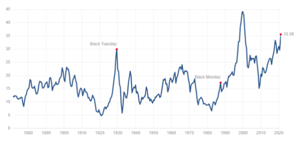
To make sense of this ratio, the higher the Shiller PE ratio, the more investors are willing to pay for companies today on their future earnings.
As shown above, the current Shiller PE ratio is 35.58, which is well above the all-time mean of roughly 17 times. The only time the Shiller PE was higher than what it is now was during the Dot Com bubble in 2000.
The Shiller PE ratio is a fairly crude metric. It doesn't take into account where interest rates are or the quality of companies that make up the market.
Indicator 2 - Buffett indicator
The Buffett Indicator is the ratio of total US stock market valuation to GDP.
The stock market can be seen as investors' expectations of future economic activity, whereas GDP is a measure of historical economic activity. Therefore, while the Shiller PE ratio is the equivalent to the price-to-earnings ratio, the Buffett Indicator is more like the price-to-sales ratio of the entire economy.
Figure 2: Total Market Value to GDP
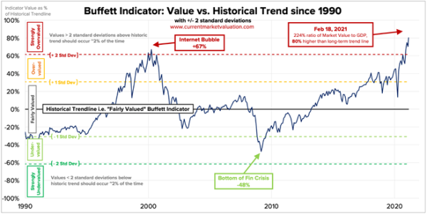
According to www.currentmarketvaluation.com, the Buffett Indicator is more than two standard deviations over the historical trendline, which happens less than 2% of the time. The last time the markets were trading at this valuation was during the 2000 dot-com bubble.
The current indicator is trading at 80% of the historical trendline, and the market value is more than twice the underlying GDP, which signals that markets are strongly overvalued.
Before you get spooked by this indicator's results, we probably need to put some context around these to explain the limitations to it. Firstly, it does not consider the nature of the companies making up total market value. For example, technology stocks tend to trade at above-average valuations relative to the general market, hence why the stock market capitalisation in the recent decade is higher as a proportion of total GDP.
Secondly, because this indicator is a price-to-sales ratio, it assumes that the economy's profit margins will return to the mean, or in other words, go down to where it was previously. This might not be the case as technology stocks tend to have higher profit margins than the old economy. According to the indicator, since they make up a larger share of the economy, these stocks will drive up how overvalued the stock market is.
Lastly, the US share of global GDP has been shrinking over time as overseas economies such as China have expanded. The rise of cross-listings (especially on the NYSE) has caused the total US market capitalisation to increase, distorting the Buffett indicator even more.
Despite its shortcomings, the Buffett Indicator shows us that investors are overly optimistic and paying top dollar for stocks.
While the Buffet Indicator and the Shiller PE ratio paint us a picture that the markets are expensive at current prices, these following indicators and measures show us otherwise to give us a more balanced view.
Indicator 3 – Comparing earnings to interest rates
The 1-year forward earnings yield vs 10-year U.S. treasury yield differential is a measure of the excess returns of investing in companies over government bonds. The extra returns are to compensate you for the added risk you take when investing in companies.
For example, the risk involved with investing in companies is that there is a chance that the company that you invest in goes bankrupt. Also, any dividend payments from companies are not guaranteed, compared to interest payments from a savings account which is more or less consistent.
As interest rates decrease, the differential will typically get wider. As the difference between the extra returns of investing in stocks and putting your money into bonds grows wider, investors will be more incentivised to invest in stocks.
Figure 3: 1-Year Forward Earnings Yield vs 10-Year U.S. Treasury Yield Differential
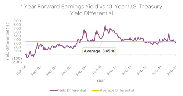
The current differential is 3.16%, which is slightly lower than the average differential. This gives us a more well-rounded idea than measures such as the Shiller PE ratio and the Buffett indicator because it considers future earnings as well as interest rates.
Given the ultra-low interest rate environment we live in, the stock market may not be considered overvalued if interest rates continue to stay low.
On that note, central banks all over the world have signalled that they intend to keep interest rates low for the next few years to keep their economies afloat during this time of crisis. Therefore, the critical question we should ask ourselves when looking at the differential is how long real interest rates will stay low.
If they stay low for the next 5 to 10 years, then the current market valuation does not seem exorbitant.
Indicator 4 - Forward-looking S&P 500 PE ratio
While the Shiller Cyclical Adjusted PE ratio and the Buffett ratio are backwards-looking indicators, the forward PE ratio shows what market analysts are expecting going into the next few years. As markets are forward-looking, the forward PE ratio is arguably a more accurate indicator of valuation than historical valuations.
Figure 4: The S&P 500 PE Ratio
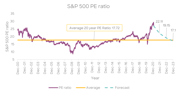
As shown above, the average PE ratio over the past 20 years is 17.72 times, while the forecasted PE ratio for FY2021 is 22.11, FY2022 is 19.15, and FY2023 is 17.1. Thus, the market is expecting that the market valuations will fall back in line with historical trends in the next few years assuming there is no price increase in the S&P 500.
The current PE ratio of 27 times is well above the historical average because of the severe impact of the pandemic, reducing companies' earnings reported in FY20, thereby increasing the PE ratio. Going forward into FY21, we expect that companies in the S&P 500 are set to rebound from the pandemic, as signalled by EPS forecasted to grow 24% next year, 15.4% in FY22, and another 11.9% in FY23.
Indicator 5 - Quality of businesses that make up the market
Over the past 20 years, the makeup of the S&P 500 has changed. We've seen the market domination of the five Big Tech stocks: Facebook, Amazon, Alphabet (Google), Apple, Microsoft. These businesses have thrived as our world became more digitalised, and COVID-19 only accelerated that shift.
Collectively, Information Technology stocks make up 27.8% of the S&P 500, and the five Big Tech stocks generated more than $200 billion in free cash flow in 2020. Furthermore, they are expected to grow another 18% in 2021, showing continued strength in business fundamentals.
Some may say that the top 5 Big Tech stocks over-represents the S&P 500, though that is due to their strong performance during the crisis. One way to measure a business's quality is through their return on equity (RoE), which measures how profitable companies are in relation to their invested equity.
Figure 5: S&P 500 Return on Equity
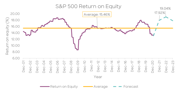
Though the current ROE is below the average, it was mainly due to the earnings drop related to the pandemic. On a forward basis, ROE is expected to be 17.92% in FY21 and 19.04% in FY22. For high-quality companies such as these, paying an above-average price can be considered reasonable, and on this basis, stocks do not look as expensive as it seems.
Indicator 6 - Comparing corporate free cash flow to interest rates
Figure 6: 1-Year Forward Free Cash Flow Yield vs 10 Year Treasuries
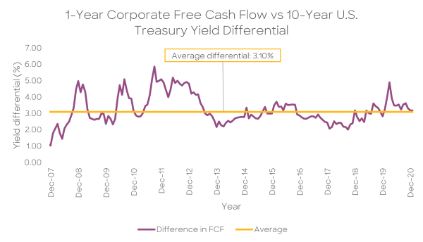
Another measure that we can use to assess the markets' valuation is to use the differential between the corporate free cash flow yield and the 10-year Treasury yield. Free cash flow yield is a measure of a company's capacity to return cash to its shareholders.
As seen in the chart above, the current difference between corporate free cash flow and the 10-year U.S. treasuries of 3.18% is in line with the historical average of 3.1%. As such, based on this relative metric, stocks do not appear to be expensive.
On a forward basis, the price to free cash flow of the S&P 500 for FY21 is estimated to be 24.71 times, implying a free cash flow yield of roughly 4.04%. Compared to the 10-year U.S. treasury bond rate of 1.08%, the difference between the two is around 3%, making investing in the stock market seem a lot more attractive.
Should overvalued markets concern long-term KiwiSaver investors?
We know that investing in a broad-based index fund have generated investment returns of roughly 6-8% per annum. We also know that investments in stocks provide better returns than holding cash over the long term.
What we don't know is when the markets will crash. Despite the sensational reporting of the market crash happening in the next few weeks, months, or a couple of years' time, no one knows when a correction will come or how severe it will be. We know it will happen because it always does; we don't know when or how much further the market will rise before it happens.
Long term investors can take comfort, knowing that the stock market has been one of the best ways to grow wealth over time. Trying to sell before the markets crash can prove costly because there is a real cost to staying uninvested, as compound interest cannot work its magic.
The returns going forward may not continue in a linear upward path, but as we've seen during the COVID-19 March 2020 crash, investors who stayed the course fared much better than those trying to time the market. As famed investor Peter Lynch mentions, "Far more money has been lost by investors preparing for corrections or trying to anticipate corrections than has been lost in corrections themselves."
The key is to ensure you have a timeframe that allows you to remain invested for long enough for markets to recover and that you have a wide enough exposure to ensure that you are not exposed to any single company or sector.
If you are looking for a plan to achieve a long-term financial goal despite the market's ups and downs, Kōura's KiwiSaver Scheme can help you with that.